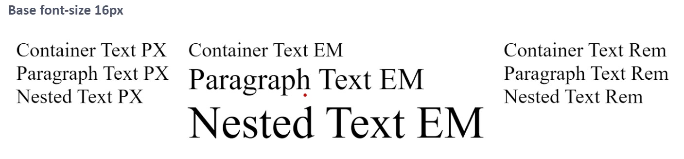
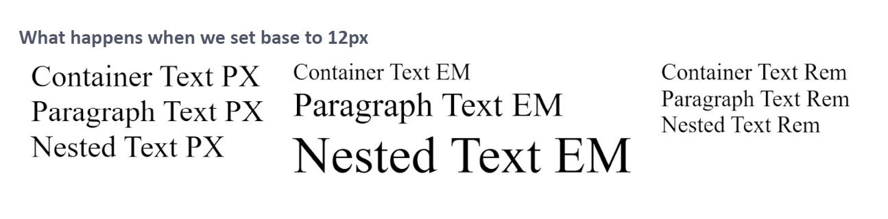
Why Using rem Units Improves Web Design: A Guide to Better Accessibility
Hey, in the super-fast-changing world of web design, you've got to keep up with the latest tricks to make your website user-friendly and accessible. One trick that is sometimes forgotten is using the rem unit for sizing elements. So let's talk about why you should love rem for making your website more user-friendly.
Making Websites More Accessible
Accessibility is a big deal. Using rem instead of fixed units like px lets users change their browsing experience to fit what they need or like. Some people need to change the font size so they can see or read better, or just because they prefer it. By using rem, we make sure our designs can handle these user changes. This leads to a better experience for everyone and happier users overall.
Keeping Your Website Uniform with REM
Consistent sizing across your website is way easier with rem. It's related to the root element, so it means the sizing stays the same everywhere on the site. This makes designing simpler and helps you keep everything looking uniform across different sections and pages. It just ends up looking more professional.
Making Your Site Responsive
When we talk about responsive web design, we mean layouts that work well on any device and screen size. rem helps us with this by letting us adjust element sizes according to the root element's font size. This means your website looks and works well on anything from a phone to a massive desktop screen.
Scaling and Maintaining Your Design with Ease
Scaling and maintaining your design is a piece of cake when you're using relative units like rem. Need to make the design bigger or smaller? Just tweak the root element's font size, and you're done. This saves you time and makes things easier to maintain, as you won't need to change styles or make a bunch of CSS adjustments.
Future-Proofing Your Website Design
As web technologies keep advancing, you want to make sure your websites can keep up. Using rem helps make your designs flexible and ready for future changes in what users prefer, devices, and tech trends. This way, your website is more likely to stay successful over time.
In a Nutshell: Why You Should Embrace REM
In a nutshell, using rem units in web design gives you a ton of advantages in usability, accessibility, responsiveness, and maintenance. If you start using this relative unit, you can make websites that appeal to more people, are ready for future tech changes, and offer a top-notch user experience. So, it's high time we wave goodbye to those fixed pixel values and start enjoying the perks of using rem in your next web design project.
Working example: https://codepen.io/Happy-paw/pen/BaqMadQ


 The No-Framework WebApp workshop Coltbaan 4C, 3439NG Nieuwegein